ShopDreamUp AI ArtDreamUp

Deviation Actions


Description
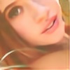
Model: Chelsea Furey
Work has been murder lately, but I'm determined some of my newer photos more regularly.
Work has been murder lately, but I'm determined some of my newer photos more regularly.
Image size
5616x3744px 8.84 MB
Make
Canon
Model
Canon EOS 5D Mark II
Shutter Speed
1/41 second
Aperture
F/3.2
Focal Length
100 mm
ISO Speed
100
Date Taken
Nov 1, 2011, 9:45:39 PM
Sensor Size
37mm
© 2011 - 2024 Kendra-Paige
Comments6
Join the community to add your comment. Already a deviant? Log In
From a technical standpoint, there are a couple things that come to mind in regards to critiques here.
Focus: Usually, as I'm sure you know since you have been at this for some time, the viewer's attention goes straight to the eyes of a subject if they have them. Arguably, one of the most important technical aspects of any sort of portrait is that the eyes are in focus. Since you shot this as a somewhat wide aperture, it would be difficult to get both eyes in focus with a pose like this. It may have even been impossible. In any case, having only one eye in focus is distracting. Sure, you could call the shallow DOF dreamy, but I think it would have been more powerful with either the full face in focus or shot at slightly different angle where it would be less obvious that the far side of her face is out of focus.
Exposure: Not all lighting conditions are ideal and often times we are made to put up with some really awful light. Dappled light when shooting outside can cause a lot of problems and part of me wonders if you had a patch of sunlight get though and hit her far shoulder. The reason for bringing attention here is that the highlights there are blown and you've lost detail in the fabric of her shoulder. You may have been able to either expose for that spot on her shoulder and try to bring out the shadows in post, exposed for the bright spot and used more fill light from a flash or reflector, or simply moved her a couple steps away from that spot.
Composition: The expression on her face is excellent and I'm glad that you've brought yourself in close enough for us to be able to see it even if much of her face is just out of focus. I myself am wary of composing in a way where the top of the subjects head is cut off but it's a valid framing and works well in this image. My only complaint is that it feels too confined on the left side of the image. Your subject is peering off to the left, but what is she looking at with such scorn? We don't have much room to even contemplate this. Composing just a bit more to the left would give her some more gazing room and make the image feel more comfortable.
I know this is an older image but you mentioned that you were looking for input on your journal. I hope this is of some value.