ShopDreamUp AI ArtDreamUp

Deviation Actions


Suggested Deviants


Suggested Collections


You Might Like…


Featured in Groups


Description
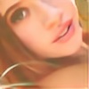
Contrast: Black & White versus Color / Rigid versus Shapely / Stoic versus Expressive
Model: Jillian Roggenthien
Photography: =Kendra-Paige
Designer: Narcisco Rodriguez
Second half of an experiment with style and concept - revolving primarily around contrast. I took some rigid and doll-like images, and others that were much more expressive. It was fun putting an attire of black and white amidst such colorful backgrounds.
Comments and feedback would be greatly appreciated!

Follow Me On: Gallery l Website l Facebook l Flickr
Model: Jillian Roggenthien
Photography: =Kendra-Paige
Designer: Narcisco Rodriguez
Second half of an experiment with style and concept - revolving primarily around contrast. I took some rigid and doll-like images, and others that were much more expressive. It was fun putting an attire of black and white amidst such colorful backgrounds.
Comments and feedback would be greatly appreciated!
Follow Me On: Gallery l Website l Facebook l Flickr
Image size
5970x4488px 14.42 MB
Make
Canon
Model
Canon EOS 5D Mark III
Shutter Speed
1/200 second
Aperture
F/1.6
Focal Length
85 mm
ISO Speed
100
Date Taken
Nov 28, 2012, 8:50:01 AM
© 2012 - 2024 Kendra-Paige
Comments15
Join the community to add your comment. Already a deviant? Log In
First of all I'd like to say this is a fantastic way to familiarize yourself with your new camera. (congrats again <img src="e.deviantart.net/emoticons/w/w…" width="15" height="15" alt="
Beautiful photos both this one and the 1st one in this series. <img src="e.deviantart.net/emoticons/s/s…" width="15" height="15" alt="
It is obvious you develop a connection with your models since you're getting such real emotions and such good poses.
Her outfit looks very clean, almost sterile compared to the environment around her - a nice touch and yet another element that adds contrast.
It's also interesting that you've chosen to contrast, not only the colors and "cleanliness" (I couldn't find a better word for it), poses as well.
In my opinion this looks very good and thought-through in just about every aspect.
Even though basing photos on contrasts has been done a whole lot before, I feel this series is quite refreshing, relaxing and pleasing to look at.
There is some slight chromatic aberration on the bushes making them and certain elements look somewhat soft, but they aren't the main focus at all, so it is simply nitpicking.
One last thing: I can see some repeating patterns in the grass - was there something that needed to be cloned out?